Creating a home that flows isn’t about the tired advice of painting every room the same colour. The real secret to a professionally styled space lies in defining a core ‘design language’—a cohesive set of foundational materials, textures, and a flexible colour story. Mastering this language allows you to create variety and personality in each room while ensuring the whole home feels unified, intentional, and ultimately, more valuable.
There’s a common frustration among homeowners who love design but work without a professional. You meticulously decorate one room, then another, and another. Each space might look great on its own, but the journey between them feels… disjointed. The hallway clashes with the living room, which feels like it belongs in a different house to the kitchen. It’s a collection of individual statements, not a cohesive home. The standard advice often circles around picking a single paint colour and using it everywhere, but this can lead to a home that lacks personality or feels sterile.
What if the solution wasn’t about rigid rules, but about learning a new way of thinking? The true key to visual harmony is to stop decorating room by room and start thinking about your entire home as a single entity with its own ‘design language’. This isn’t about making everything match. It’s about ensuring every element—from the floor beneath your feet to the handle on a door—is part of the same thoughtful conversation. It’s about creating intentional connections that guide the eye and create a sense of calm and completeness.
This guide will walk you through the core principles for creating that language. We’ll move beyond superficial tips and delve into the foundational elements that truly unify a space, from the powerful impact of continuous flooring to a sophisticated approach for creating a colour story that works everywhere. You’ll learn how to mix furniture styles to look curated rather than chaotic and even how to apply these ideas in a rental. Finally, we’ll look at the hard data on why creating this visual harmony isn’t just an aesthetic exercise—it has a real, measurable impact on your property’s value in the UK market.
This article provides a complete framework for thinking like a designer and creating a home where every room feels like it belongs. Below is a summary of the key areas we will cover to help you achieve seamless visual flow.
Summary: A Practical Guide to Creating a Cohesive Home Interior
- The 3 Design Rules That Make Any Home Look Professionally Styled
- Why Continuous Flooring Unifies Spaces Better Than Paint Colour Schemes
- How to Choose 5 Colours That Work in Every Room From Hallway to Bedroom
- The Furniture Style Clash That Makes Your Home Look Chaotic Rather Than Curated
- How to Create Design Cohesion in a Rental Using Removable Decor for Under £600
- Why Magnolia and Grey Outsell Bold Feature Walls by 6 Weeks on Average
- Empty Rooms vs Staged Interiors: Which Increases Perceived Value in London
- What Makes UK Properties Sell in Under 30 Days While Others Languish for Months
The 3 Design Rules That Make Any Home Look Professionally Styled
To make your home look professionally styled, you need to think less about individual items and more about the underlying story they tell together. This is your home’s design language. Forget rigid, intimidating rules and instead embrace three guiding principles: repetition, rhythm, and scale. Repetition is the simplest way to create unity; it’s about consciously repeating a colour, a material, a shape, or a texture in different rooms. A brass tap in the kitchen can be echoed by brass picture frames in the living room and a brass light fitting in the hallway. This isn’t about being monotonous; it’s about creating familiar touchpoints.
Next is rhythm. If repetition is repeating an element, rhythm is about *how* you repeat it. Think of it like a piece of music. You can have a steady beat (repeating the same cushion in every room – a bit boring) or you can have a complex rhythm where the ‘beat’ appears in different forms. For instance, your chosen accent colour—say, a deep forest green—could be a whole wall in the study, appear in the pattern of the living room rug, and be just a single ceramic vase in the bedroom. This creates a more sophisticated and dynamic sense of connection.
Finally, there’s scale and proportion. This is the principle that makes a space feel ‘right’. It’s ensuring the size of your furniture and decor is appropriate for the room’s dimensions and for the other objects around it. A tiny rug in a large living room or a massive sofa in a small snug will always look jarring, breaking the visual harmony. Getting scale right ensures that even if styles differ, the pieces feel like they inhabit the space together comfortably. As the experts at Decorating Den Interiors note, “Unity and harmony are like two sides of the same coin — they work together to make a space look seamless.”
Your Action Plan: Defining Your Home’s Design Language
- Identify Your Core Elements: Look around your home. What materials, colours, and shapes do you naturally gravitate towards? List 3-5 ‘core’ elements (e.g., warm oak, brushed brass, linen fabric, curved shapes, deep blue). This is your starting vocabulary.
- Audit Existing Rooms: Go through each room and see which of your core elements are already present. Note where the language is strong and where it’s absent or contradictory. Identify any ‘rogue’ items that don’t fit.
- Create Connection Points: For your next purchase, ensure it speaks the language. Instead of buying an isolated piece, choose something that deliberately references an existing element in another room (e.g., a new lamp with a base that matches the wood of your dining table).
- Vary the ‘Dialect’: Practice using your core elements in different ways. If ‘warm oak’ is a core material, it could be the floor in one room, the picture frames in another, and a small decorative bowl in a third. Vary its application to keep things interesting.
- Check for Balance: Before finalising a new layout or purchase, step back and assess the scale. Does the new piece feel balanced with the rest of the room? Does it create visual clutter or calm? Adjust until the proportions feel harmonious.
Why Continuous Flooring Unifies Spaces Better Than Paint Colour Schemes
While paint is often seen as the easiest way to transform a room, it’s the floor that does the heavy lifting in creating a cohesive home. Think of the floor as the canvas upon which every room is built. When that canvas is consistent, flowing from one space to the next without interruption, you create a powerful sense of unity. An unbroken horizontal plane is one of the most effective tools in a designer’s arsenal for making a home feel larger, more considered, and more connected.
Changing flooring between rooms—from wood in the hallway to carpet in the living room and tiles in the kitchen—creates visual ‘breaks’. Each threshold acts as a full stop, telling your brain that one space has ended and another has begun. This fragments the home, making each area feel smaller and more isolated. A continuous floor, however, creates a seamless visual pathway, encouraging your eye to travel effortlessly from one room to the next. This tricks the brain into perceiving the combined areas as one larger, more expansive space. The effect is calming and creates an immediate sense of luxurious flow that is very difficult to achieve with paint alone.
This is why, if your budget for a renovation is limited, investing in continuous flooring will give you a far greater return on ‘visual harmony’ than agonising over multiple paint schemes. A single, consistent flooring material acts as the foundational grammar of your home’s design language, tying everything together from the ground up.
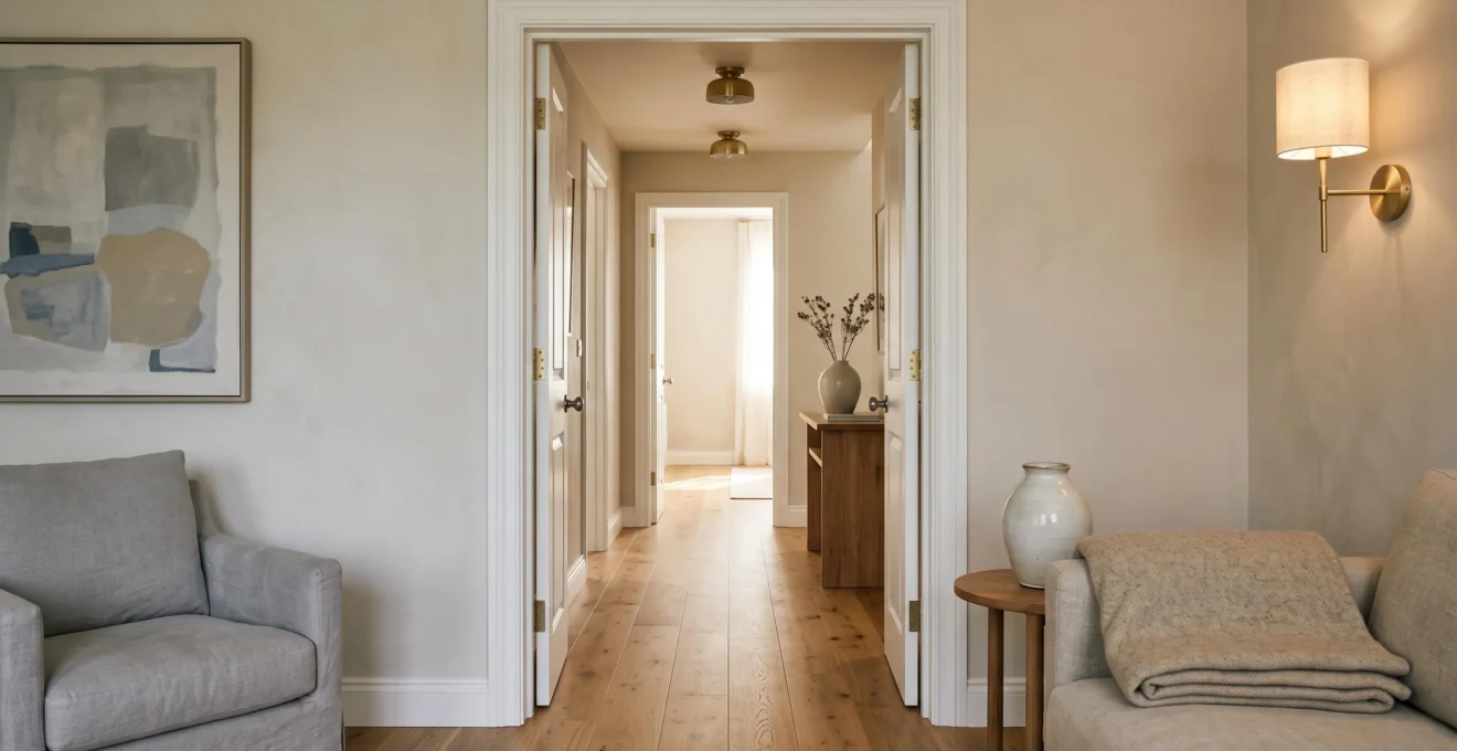
As this image demonstrates, the uninterrupted flow of the wood floor draws the hallway and the living area into a single, cohesive vista. The flooring becomes the connecting thread, allowing other elements like wall colour or furniture style to vary slightly without ever feeling disjointed. It’s the constant, reliable base note that allows for more playful melodies on top.
How to Choose 5 Colours That Work in Every Room From Hallway to Bedroom
The idea of a whole-house colour palette can feel restrictive, conjuring images of beige uniformity. But a strategic palette isn’t about using one colour everywhere; it’s about creating a ‘colour story’ with a cast of 3-5 colours that appear in different roles throughout your home. This approach provides both cohesion and flexibility. The key is to move beyond thinking of colours room-by-room and instead define a family of shades that work together harmoniously.
Start by choosing your main ‘neutral’—this will be your workhorse. It could be a soft white, a warm greige, or a light putty. This colour will likely be the dominant wall colour in your main living areas and hallways, creating the continuous backdrop. Next, choose a second, slightly deeper or complementary neutral. This could be used to create a cosier feel in a bedroom or study, or for features like kitchen cabinetry. Then, select a white or off-white for all your trim—skirting boards, door frames, and ceilings. Using the same white throughout the house is a non-negotiable designer trick that instantly creates unity.
With these three foundational neutrals in place, it’s time for the personality: your two accent colours. These should be colours you truly love. One can be a softer, mid-tone shade, and the other can be a bolder, more dramatic hue. Now you have a five-colour palette. The magic is in how you deploy them. This is where the famous 60-30-10 rule comes in handy as a guide. As BoCo Interior Designs explains, “The 60-30-10 rule guides interior designers’ color choices… in that 60% of a space is often devoted to a primary color, usually the color of the walls.” In one room, your main neutral might be the 60%, with an accent as the 10%. In the next room, you could flip it, using the accent colour on a feature wall (30%) and your secondary neutral as the main colour (60%). The colours are the same, but their roles have changed, creating a space that is both different and connected.
The Furniture Style Clash That Makes Your Home Look Chaotic Rather Than Curated
One of the biggest fears for a DIY decorator is creating a home that looks like a chaotic jumble of mismatched furniture. The knee-jerk reaction is to buy everything from a matching set, but this often results in a space that lacks soul and personality. The goal isn’t to match; it’s to create a thoughtful ‘dialogue’ between your pieces. A curated home successfully mixes styles, eras, and textures, but it does so with intention. The difference between a chaotic clash and a curated mix lies in finding connection points.
A space feels chaotic when furniture pieces have absolutely nothing in common. An ornate Victorian armchair, a chunky 1980s leather sofa, and a sleek minimalist glass coffee table will likely fight each other because they share no common design language. A curated look, however, finds a subtle thread to link disparate items. You can successfully mix a modern sofa with a vintage wooden cabinet if they share a similar leg style (e.g., both are tapered), a similar scale, or if the wood tone of the cabinet is picked up in the sofa’s cushions. These small, intentional echoes are what make the mix work.
Think of it as creating a family of objects. They don’t need to look identical, but they should share some ‘family traits’. This could be:
- Material: A common material like warm wood, black metal, or brass can tie together furniture from different styles.
- Colour: A shared colour, even in small doses, can link a modern print with a traditional piece of furniture.
- Silhouette: Pieces with similar shapes or lines (e.g., all clean and linear, or all soft and curved) will feel more harmonious together, even if their styles differ.
The image above perfectly illustrates this concept. The industrial metal chair and the traditional wooden chair are stylistically worlds apart. Yet, they work together in a ‘visual dialogue’ because they are connected by a shared warm wood tone and a similar tapered leg silhouette. They are different, but they are clearly speaking the same design language. As The Style Saloniste advises, “You can mix different elements while maintaining connection points. Vary textures, heights, and shapes while keeping common colors or materials.” This is the secret to a home that feels collected and personal, not straight out of a catalogue.
How to Create Design Cohesion in a Rental Using Removable Decor for Under £600
For renters, the challenge of creating a cohesive home is amplified. You’re often working with unchangeable elements like questionable carpets, dated kitchen cabinets, or the landlord-mandated magnolia walls. The temptation is to give up, but creating harmony in a rental is entirely possible—it just requires a shift in focus from permanent changes to strategic, removable additions. The goal is to layer your own design language on top of the existing canvas so effectively that the ‘landlord special’ features fade into the background. And it doesn’t require a huge budget; as one study highlighted, with UK renters spending nearly £700 on average to make their house a home.
The first step is to work *with* what you can’t change. If you have a beige carpet, embrace a warm, earthy palette for your decor. If you have grey kitchen units, lean into a monochrome or cool-toned scheme. Fighting the base colours will only create more discord. Instead, use your chosen colour and material palette to create strong, repeated themes in your own items. Your ‘design language’ will be spoken through textiles, lighting, art, and accessories. Think large-scale rugs to cover floors and define zones, cohesive cushion covers and throws across different rooms, and a consistent metal finish (like black or brass) for lamps, mirror frames, and decorative objects.
Portable lighting is a renter’s best friend. The bog-standard ‘big light’ in the middle of the ceiling rarely creates a good atmosphere. Invest in a family of floor lamps and table lamps that share a common style or material. Spreading them across different rooms creates a warm, inviting glow and another layer of visual repetition. For walls, use large, commanding art prints hung with non-damaging strips or leant against the wall. A triptych of prints with a common theme or colour palette split across a hallway and living room is a powerful way to create connection. Finally, don’t underestimate small swaps. Changing out drawer knobs, light shades, or even tap fittings (remembering to keep the originals to switch back) can have a huge impact. It’s about layering your world on top of the rental’s foundation.
Key takeaways
- Define a Design Language: True harmony comes from a consistent ‘language’ of materials, colours, and shapes, not from rigid, matching rules.
- Prioritise the Foundation: Continuous flooring is the single most powerful tool for unifying a home, creating a seamless flow that paint alone cannot achieve.
- Cohesion Boosts Value: A visually harmonious and well-presented home is not just pleasant to live in; it demonstrably sells faster and for a better price in the competitive UK property market.
Why Magnolia and Grey Outsell Bold Feature Walls by 6 Weeks on Average
When you’re living in your home, personal expression is paramount. A vibrant, bold feature wall can be a source of daily joy. However, the moment you decide to sell, the game changes. The goal is no longer to please yourself, but to appeal to the broadest possible range of potential buyers. This is where neutral colours like magnolia, greige, and soft greys come into their own. While they may seem ‘safe’ or ‘boring’ to a design enthusiast, in the property market, they are powerful tools of persuasion. A neutral wall is an empty canvas, and that’s precisely what buyers want.
A bold, highly-personalised feature wall forces a buyer to make a decision. They either love it or they hate it. If they hate it, they immediately start calculating the cost and effort of re-painting—a mental hurdle that can put them off a property. An empty, neutral room, on the other hand, allows buyers to project their own lives, their own furniture, and their own style onto the space. They can mentally ‘move in’ without the barrier of someone else’s taste. This psychological ease is critical in a fast-paced market. It’s less about the colour itself and more about what it represents: potential and a hassle-free start.
The data backs this up. Buyers are demonstrably drawn to neutral palettes because they feel more spacious, brighter, and easier to imagine living in. In fact, new research by Samsung Electronics UK found that 30% of buyers are more likely to purchase a home if the rooms are painted light grey. In a market where first impressions are everything, creating a neutral, cohesive, and harmonious backdrop gives your property a significant competitive advantage, helping it to stand out for its potential rather than its personality.
Empty Rooms vs Staged Interiors: Which Increases Perceived Value in London
When selling a property, especially in a competitive market like London, a common debate is whether to present it empty or staged. An empty property might seem like a ‘blank canvas’, but for most buyers, it’s a puzzle they can’t solve. As the design experts at RoomLift put it, “An empty room forces a buyer to do mental math, where does the sofa go, will my bed fit, how big is this really?, and most buyers simply can’t.” An empty room often appears smaller, its flaws more prominent, and its purpose unclear. Buyers struggle to connect with it emotionally.
This is where home staging proves its worth. Staging isn’t about filling a room with clutter; it’s about using furniture and accessories to tell a story. It defines the purpose of each space (this is a cosy reading nook; this is a dining area for entertaining), demonstrates scale (a king-size bed fits comfortably in this room), and creates the very visual harmony we’ve been discussing. A well-staged home provides the crucial connection points that allow a buyer to imagine their life there. It transforms a collection of empty boxes into a desirable, functional, and aspirational home.
The impact is not just emotional; it’s financial. Professional staging helps buyers to visualise the property as a home, which in turn increases its perceived value. They are not just buying bricks and mortar; they are buying a lifestyle. While the UK market is still catching up to the US in this regard, the principle is universal, and the data is compelling. For instance, a National Association of Realtors report revealed 29% of agents saw a price increase of between 1% and 5% on the value of a home that was staged versus one that was not. For a property in London, that percentage translates into a significant financial gain, often far outweighing the cost of the staging itself.
What Makes UK Properties Sell in Under 30 Days While Others Languish for Months
In the dynamic UK property market, the difference between a quick sale and a property languishing for months can come down to a few critical factors. While location and price will always be the primary drivers, the presentation and ‘feel’ of a home have become increasingly significant differentiators. In a market where buyers often view multiple properties in a single day, the ones that sell quickly are those that make an instant, positive emotional connection. This is where all the principles of visual harmony come together to create a powerful commercial advantage.
A cohesive, well-presented home that flows beautifully from room to room feels cared for, requires no immediate work, and allows buyers to mentally move in straight away. It removes friction and doubt from the decision-making process. A disjointed property with clashing styles, bold personal decor, and visible signs of wear and tear does the opposite. It creates a mental ‘to-do list’ for the buyer, adding perceived cost, effort, and stress. Even if the asking price is competitive, the psychological barrier can be enough to make a buyer hesitate and move on to the next property on their list.
The speed of the market underscores this point. Even in a fluctuating climate, well-presented properties move fast. For example, recent Zoopla research found that 49% of sales were agreed within 30 days of listing in some of the UK’s fastest-moving local markets. To be in that successful half, a property needs to tick all the boxes, and presentation is a major one. As Zoopla’s Richard Donnell points out, the national average often masks huge local variations: “While the national time to sell has barely moved, that stability is masking a real divide opening up between local markets.” In these competitive micro-markets, a home that feels harmonious, staged, and ready to live in is not a luxury—it’s a necessity for securing a quick and successful sale.
Ultimately, creating visual harmony is the most effective way to elevate your home from a simple collection of rooms to a cohesive and desirable whole. By understanding and applying these core principles, you can take control of your space, create a home that feels both personal and professionally designed, and unlock its maximum potential and value.